Case study, English content & authority site
analystengineering.com
A content site that needed to become a recognized authority in its field and build an audience over time, while being easy for AI assistants to read and recommend, not just search engines.
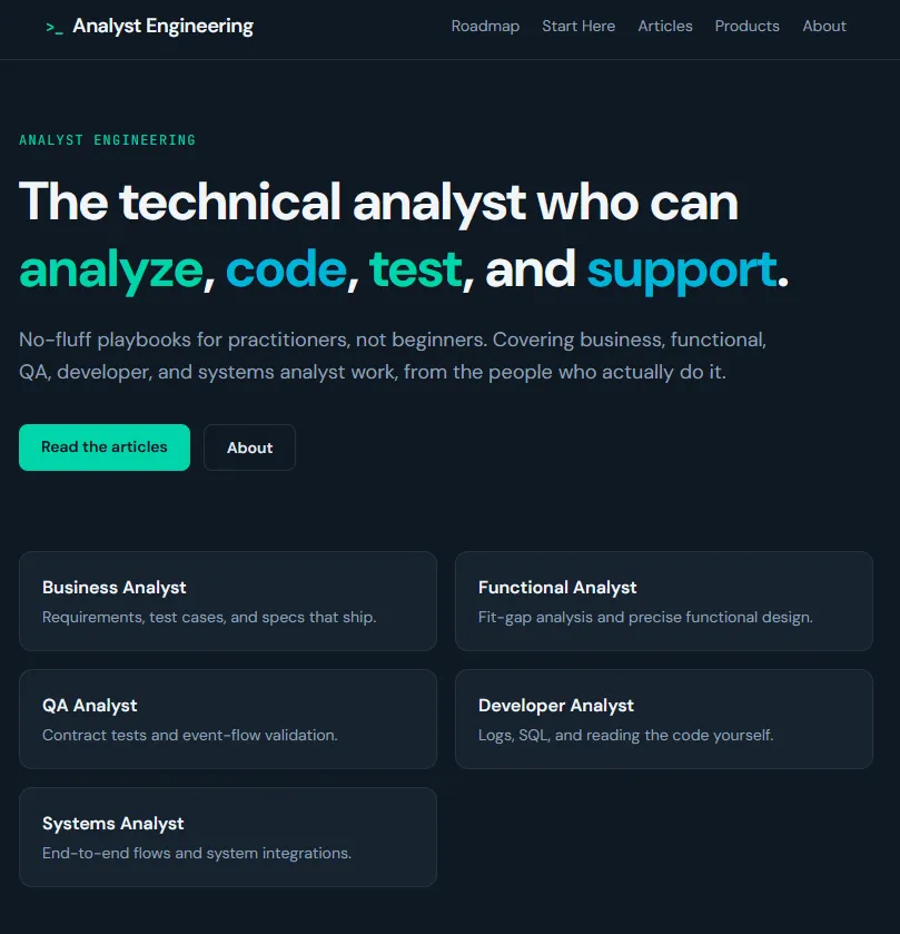
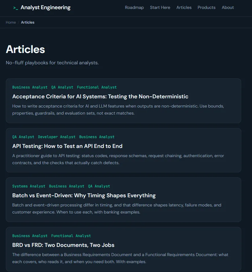
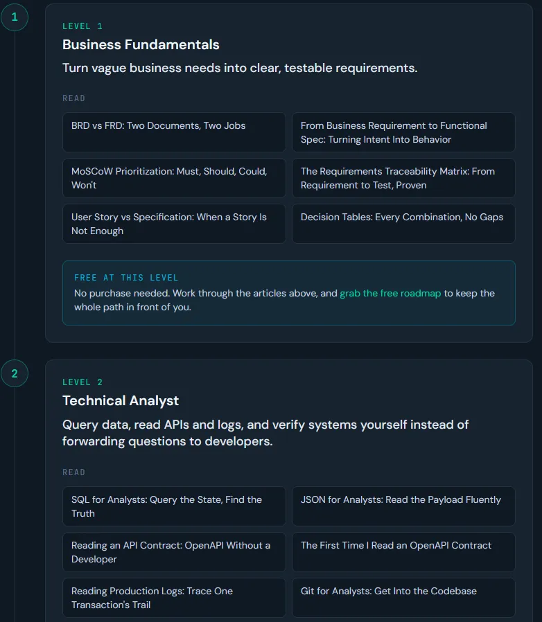
Before
Scattered posts with no clear structure, no email sign-up, and nothing telling AI what the site was an authority on.
After
The content organized around five core topics, with supporting articles under each, so the site builds real depth in a defined set of subjects.
▸ What I built
- ·The content organized around five core topics, with supporting articles under each, so the site builds real depth in a defined set of subjects.
- ·A newsletter sign-up that turns readers into an audience the site owns, not one rented from a platform.
- ·A plain-language map for AI assistants, so they can discover the main topics and understand what the site is an authority on.
- ·Behind-the-scenes labelling and clean structure so each article is easy for Google and AI to read.
▸ Getting it found on Google and AI
- ·Articles grouped and linked by topic, so each theme reads as one coherent body of work rather than scattered posts.
- ·Content written as clear answers, so AI assistants can quote it and credit the site.
- ·A clean map of all the content for both AI assistants and Google.
- ·Fast pages that search engines can read without trouble.
▸ Speed and performance
Articles are fast to load and easy for search engines to read. The newsletter and any extra scripts never get in the way of reading.
Rendering
JavaScript
Crawlability
▸ A usability problem, and the fix
The critique
Readers arriving on a single article had no sense of the surrounding body of work and no reason to stay or return, so the site leaked the attention it earned.
The fix
I added pillar navigation and contextual links from every article into its theme, plus a single clear newsletter prompt, so a reader who lands on one piece is shown the rest and given a reason to subscribe.
Outcome
The site now has a clear topic structure, a newsletter sign-up that builds an audience it owns, and the setup that lets AI assistants find and quote it. The site is recent, so subscriber and traffic figures are still accumulating and will be added here as they are measured.